

I got this email from shieldapp.ai.
Right now, it's particularly relevant to me because I'm working on developing B2B case studies and thinking about the following:
- How do we best format the case studies layout-wise?
- How should we repurpose and distribute the content be it the video interview or also the write-ups we create?
While this is in email format, I think this format (or something similar) could work nicely as well for a case study on the blog.
What I like and why
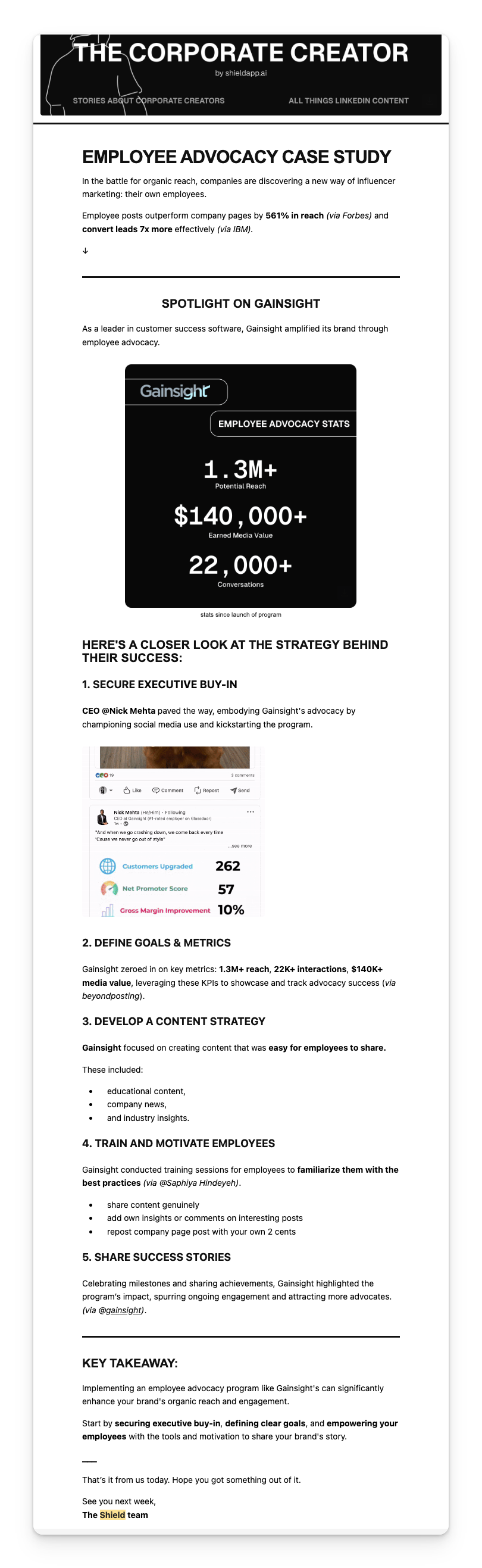
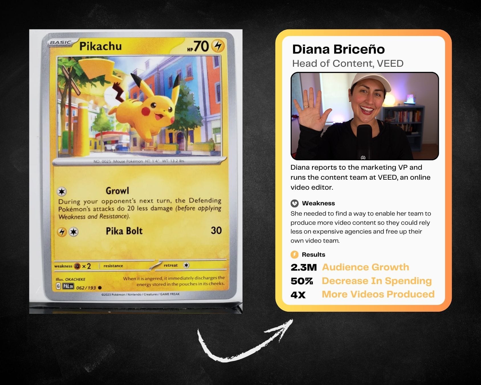
Scorecard summarizing key outcomes
This quick visual summary of outcomes helps me decide from the get-go if this is impressive enough for me to keep reading (or dive straight into checking out their product).
What if every case study had a scorecard or "trading card", like this is Pokemon, of their own? These scorecards in themselves could be content reworked for social or even for sales assets.
"Here's a closer look..." section
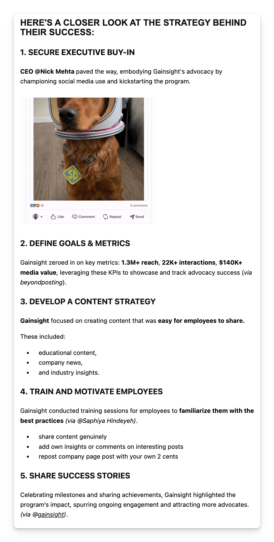
I love the easy-to-digest breakdown digging deeper into how the numbers on the scorecard were achieved.
Unlike a lot of other case studies that go into ultra-granular detail, this one doesn't give me a sense of doom in terms of the time investment I'd have to put in to get the gist of what happened and why.
Information fatigue is real.
Sometimes I'll make time to read a long piece of content, podcast, or video. But that's if either:
- I already trust the quality of the content from the brand or also...
- The content sounds like something super original I can't find elsewhere
So chances are, if I don't know you, I don't want to have to work hard to read your mega-sized case study and comb through the chunks of text to (hopefully) dig up what I need out of it.
That said, there is a world where longer versions of the can exist but I think having bite-sized versions are a great way to reel in interest. You can always provide a deeper look if requested be it through a longer form piece or on a call with the sales team.
What I'm not a big fan of and how I would've done better
The key takeaway and closing section
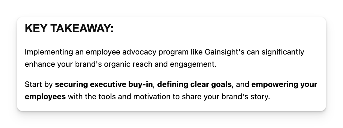
Something feels rushed, incomplete, or maybe it's that this section isn't necessary. I think the here's a closer look section was the key takeaway in itself and they could've done without the key takeaway paragraph.
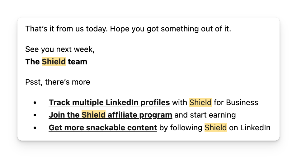
The closing is not terrible but it's not great either. I think some companies don't want to come off too strong by hard-selling their product and instead come off too passive or vague.
How would I have fixed this?
I would've rathered they tell me I can read more success stories about how brands like mine are winning with Shieldapp OR I can dive straight away into achieve results like this by using Shieldapp and then being directed to their site.
In fact, I think they could've also mentioned themselves more in the how they did it section.
I don't pay for Shieldapp. It has been months since I last was on their site so I actually had no idea who they were or what this was even about when I clicked the email.
I didn't piece together this was an email from a LinkedIn analytics tool and not just a content creator documenting stories about corporate creators like the email header says.
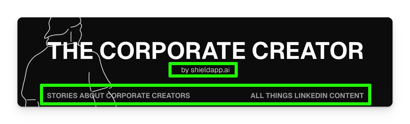
- The "by shieldapp.ai" text is small, thin text making it hard for the eye to track and low in the totem pole of text hierarchy
- The corner text "stories about corporate creators" and "all things linkedin content" are more prominent
- In the split second I skim through this section of the email, it leads me to think this is coming from a person who likes documenting these stories
I think it's important, especially with content like this closer to the middle and bottom of funnel, to sell in a more obvious way.
If you're making truly interesting content about a product that's equally as great then there's nothing "dirty" about a shameless plug telling people how your tool helps enable X, Y, and Z to happen just like it did for the customer in your study or article.